
Ford – one of the most reputed and well-known brands in the automobile industry. Although they have been with us for over a century now, yet due to their uncompromising quality and unquestionable reliability, they always manage to top the list of favorites.
In fact, to your surprise, as of 2019, they are the largest American automaker for selling top-quality vehicles all around the globe.
Now moving to their logo, it holds a powerful minimalist emblem that is super effective and easy to remember. And as like the company, the Ford logo’s history is full of meaning along with a glorious past to tell.
Continue reading to know all about the Ford logo!
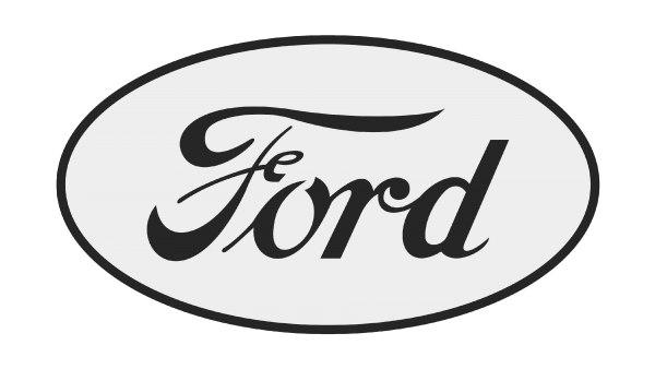
The Overview of the Ford Logo
![]()
Founded On: June 16, 1903
Founder: Henry Ford
Headquarters: Dearborn, Michigan, United States
Subsidiaries: Lincoln, Aston Martin (8%), Changan Ford Mazda (35%), Mazda (2.1%), Ford Performance Vehicles (Until 2014), Troller, Jiangling Motors
Slogan: “Go Further,” “Built Ford Tough”
What is the meaning of the Ford Logo?
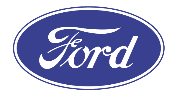
The Ford motor company comes with an oval-shaped logo having varied shades of the blue color dominating the background. In contrast, the borders and wordings are kept white. This is the present version of the logo that has been active since the year 2003. It is very simple and easy to remember!
Though they have kept their logo totally minimalist yet there exists a certain kind of elegance in the logo, which is hard to not overlook. One thing that is worth mentioning about their logo is its beautiful combination of elegance with simplicity. What a great combo indeed!
However, in all these years, they have maintained their dignity with complete gracefulness. Thanks to their superior quality and not doing any kind of compromise in this field.
The Evolution of the Ford Logo: Golden History to Unveil!
Ford has undergone through a lot of changes and modifications in all these years. However, if you do an in-depth analysis of the logo, you will see that all the changes were quite small yet effective.
Initially, they started off their journey with a pretty complicated emblem. However, with each modification, it got changed. And thus became more simple and well-suited to the automobile industry. But despite all these changes, one thing that they have maintained is their charm and magic.
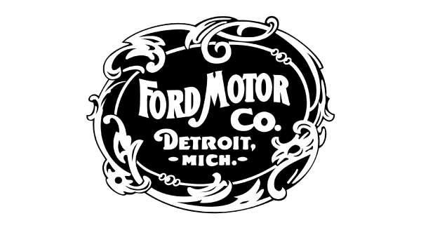
1903 – 1907
It is the first logo of the Ford Motor Company. This indeed was the most complex logo compared to all the other versions. Here, it consisted of the words “Ford Motor Co” and “Detroit Mich” to ideally reflect where the brand came from.
The words are written in a curvaceous sans-serif font with an ornate frame of leaves and swirling shapes. Back then, it had a black background with a white frame and wording. The color combination was pretty good, especially considering the time frame.
Another interesting thing was that the letters were designed in such a way that they appeared and gave more natural handwriting vibes.
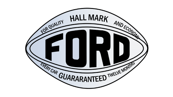
1907 – 1909
In this year, the logo got changed drastically by having an oval-shaped badge with the brand’s name placed right in the middle. Here, the flowery border and the typography handwriting all got vanished.
The brand’s name got much bolder and thus was able to grab people’s attention by effectively showing their reliability by putting words like “for quality, hallmark, and economy” in the logo. The colors also got changed from a black and white combo to a greyscale ensemble.
1909 – 1911
This is the logo based on which all the other logos were created with making modifications. This wordmark logo featured only the brand’s name by trying to copy the handwriting style of the founder, Henry Ford. Featuring an elongated “D” as like the font style in “Coca-Cola.”

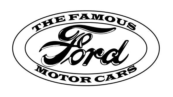
1911 – 1912
Later, in the year 1911, this handwriting got modified slightly in an attempt to make it bolder and easier to read for the people.
As a result, the company, along with making an oval border around the Ford, effectively eliminated the tail on the letter D. Instead, the border read “The Famous” at the topmost position while “Motor Cars” was on the bottom, all written in serif fonts.
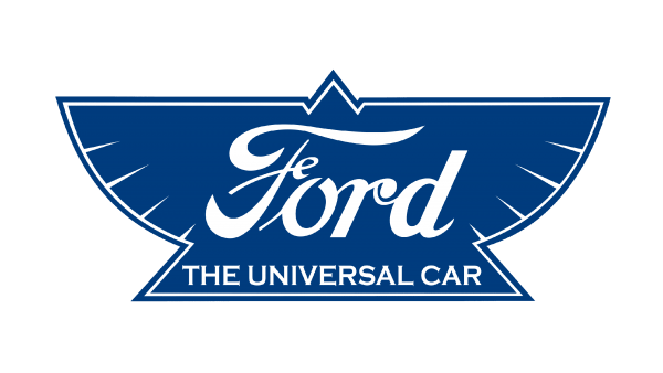
1912 – 1917
In this year, the manufacturers decided to try something new by replacing the oval badge with a shape like the bird or wings put over a triangle. It was totoally innoavtive!
Here, all the details were in blue and white color combo with keeping the new tagline “The Universal Car” right after the Ford. Super easy to read!
1917 – 1927
The bird shape was swapped back with a minimalists oval shape badge again, with the shades being in total grey and black color.
Here, the “Ford” typograph was written in a much lighter font. At the same time, the grey oval emblem, along with a thin black border, gave it a more sophisticated and stylish look.
1927 – 1957
By the year 1927, the logo encountered another change. However, this time, the color palette got changed into a beautiful blue and white color combo. Besides, the frame got doubled with a thick white lining surrounding the main badge and a thin deep blue lining around that.
1957 – 1976
In between the years 1957 and 1976, the company had done a lot of experiments with the logo but without doing any major alternations. Here, typography remained the same sized with slightly changes occurring in the weight and design slanting.
They even have tried various kinds of borders for their emblem, in an attempt to make it more iconic and elegant than ever!
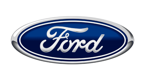
1976 – 2003
In the year 1976, the 3-Dimensional Ford badge was born. This is almost similar to the one we are familiar with now.
Here, the white typography and the border surrounding for the emblem got changed into a silver color. On the other hand, the blue background took on gradients and thus seemed more real and tactile, like the vehicle’s badge.
2003 – Current Version of the Ford logo
This Ford logo is the one that we recognize and is familiar with the most. Finally, after undergoing through a lot of variations, Ford released this simplified version without any 3D gradients and shading.
This version of the logo is quite similar to the one we had back in the year 1961, except for the varied dimensions.
However, the inscription contours got refined to a great extent compared to all the former versions of the logo. Today, the logo that stands in front of us is known for showcasing its excellence, credibility, and sophistication in the automobile world.

To Wrap Up
That’s all from the discussion regarding Ford logo history!
Ford motor company – also widely known as Ford, is an American automobile brand that is well-reputed for creating and selling top-rated commercial, luxurious, and passenger vehicles of all time.
Their logo is super easy to recognize, and you will rarely find someone who doesn’t know about them. Be it their exclusive design, world-class quality, speed, or performance – they are just too good for the value. You simply cannot but fall in love with them.
No wonder they are so popular among the people worldwide. And statistics show the rate is just escalating without taking a break, even though they have been here with us for over a century. Pretty impressive!
What’s holding you back? Drive worry-free and enjoy life to the fullest with the ford vehicles.
Now is the time to do it!
FAQs
Check out the below most asked queries people tend to have confusion upon regarding the ford logo sign:
What country owns Ford?
Ford motor company, in short, Ford, is an American multinational automobile company. Its headquarter is located in Dearborn, Michigan, United States. This great company was founded by Henry Ford back in the year 1903 on June 16.
What does the ford logo represent?
The Ford logo is a flattened oval shape that comes in varied shades of the blue and white colors. Here, the usage of the blue color shows the power, excellence, and gracefulness of the company. On the other hand, the white color showcases the credibility, sophistication, and purity.
How many changes were there in the ford emblems?
Based on all the changes analysis, the blue oval changed 11 times since the year 1903, with the last 5 iterations being pretty similar and bringing in only slight minor alterations.