Historically, the brand is the surname of the founder, Alfieri Maserati. He and his brothers were the early day’s members of this famous Car brand. However, the Maserati logo also became a part of history. More description about the Maserati logo is in the adjacent paragraphs.
The overview of the Maserati logo

Brand birth: December 01, 1914
Founder: Alfieri Maserati
Head office: Modena, Italy
Mother brand: Fiat Chrysler
Change of logo design: 10+ times
Official Website: maserati.com
What is the meaning of the Maserati logo?
The tagline of the company is excellence through passion, which means the logo represents passion along with excellence. Here, the term excellence reflects exclusiveness. Generally, this logo represents the excellent quality of automobiles that come from high passion. The company mainly prioritizes passion for making excellent cars, rather than making business.
Explanation of the Maserati logo
comes in two different colors egg or oval shape. The downside of the logo is blue. On the other hand, red is the sign of the high hill of bologna on the top. Moreover, there is a slim blue color border around the logo.
The blue color in the Maserati logo represents its strength, excellence, and class. On the other hand, the white color shows the purity and charm of the brand. Besides, the red color pillars are the supreme holding power of the city of Bologna, where the company is created.
In the blue part, the company name is written in capital letters. No more complexities are there in this logo. Overall this design looks so charming.
Overall, the logo takes serenity, strength, power, peace, and top-class passion in it. Only a few car logos come with this type of excellent meaning and wording sense. In reality, the Maserati logo has everything on offer.
The Evolution of the Maserati logo
Historically, the logo color was changed numerous times. Nonetheless, the middle icon and the name on the logo remain the same. There is a slight change in the font style also appears.
Maserati logo design: 1926 – 1937
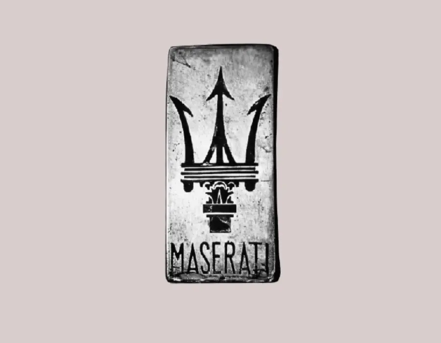
This logo design is the most ancient of them all. The logo was made in black and white color. This type of color was on songs in those periods. However, after 10 years or so, the company made necessary changes in the logo color.
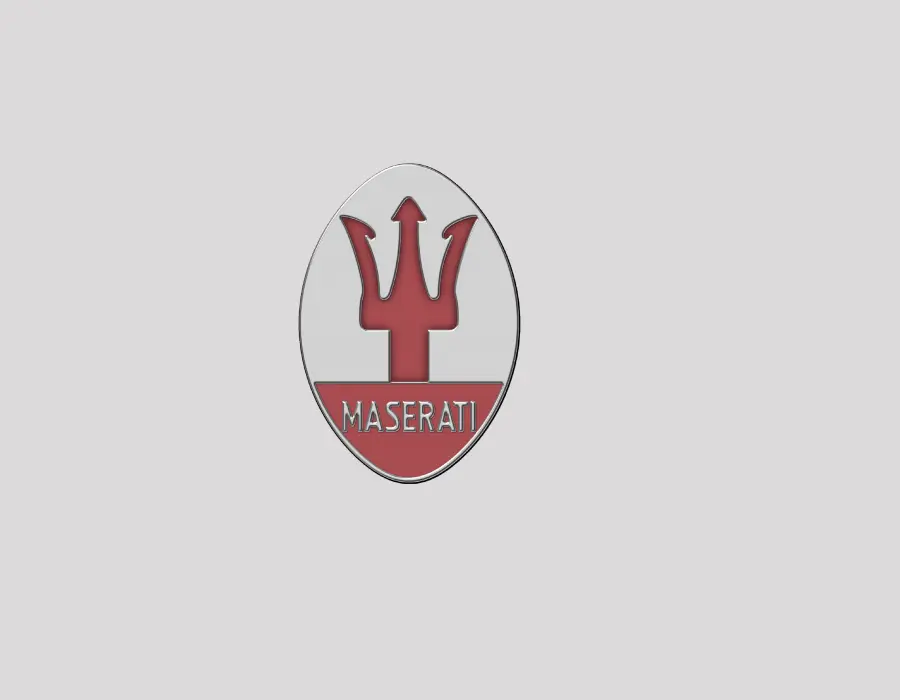
In the year of 1937, the first color logo of the Maserati logo appeared. Moreover, changes also came in the way of the first oval logo. This logo also lasted for more than 10 years. However, after an interval, the new logo design came out.
1943 – 1951: blue color Maserati logo
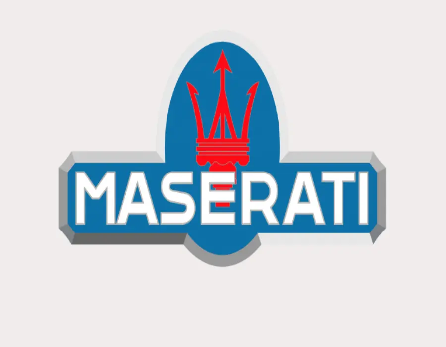
This time the logo design completely changed from the traditional shape. Moreover, the company brought the blue color for the first time on the logo. The symbol was on the middle part of the logo, which was in red.
Maserati logo design: 2015 – 2020
Later the logo was changed on multiple occasions. However, the most significant change was in the year 2015. We haven’t mentioned other changes, there was no major significance. But this time, the company completely changed the shape of the logo.
The icon was drawn in black with a completely white background. Apart from that, the company name was written in capital letters on the underneath section of the logo. At that time, the logo color was completely black and the fonts were bigger than usual.
2020 – current version of the Maserati logo

This current design also changed quite a bit, from the previous one. You may find that the middle icon of the logo is the same. However, the brand name was drawn in a different font. Maybe the company is growing in different areas of the world. That’s why they have used the magnificent font.
Although the font is not so straightforward, it looks superb on the logo. Furthermore, this logo is meant to be put on a white background, so that it easily gets adjusted with different styles of automobiles.
Sometimes, the current version of the Maserati logo reflects, a transparent style on the logo. Therefore, this current version is completely consistent with the current generation too.
Conclusion
From 1926 to 2020 the Maserati logo changed numerous times. There is also some real cause behind those consistent changes. According to our research panel, the company wanted to attract new people. Therefore, the Maserati company has designed their car logos multiple times with the generation demand.
Consistently changing the logo is a secret policy of the Maserati brand, consequently, the company is also got success in this way.
FAQs
The following section has queries and proper answers regarding the Maserati logo design.
Is the Maserati brand old?
The Maserati brand was exited on December 01, 1914. Till now this brand has successfully crossed over 100 years. It is clear that the Maserati brand is old and has authenticity.
How many times has the Maserati logo changed?
This logo was changed numerous times. Although the number is unclear, the logo was changed more than 10 times so far that’s for sure.
Will the Maserati car logo change again?
It completely depends on the policy of the brand. As per the previous analysis, the Maserati logo will be changed within the next 10 years. This brand frequently changes the logo design.
Which type of vehicles does Maserati manufacture?
Maserati manufactures different types of automobiles. However, the racing car manufacturing made this brand famous.
Read more:
Meaning of The Nissan logo – Design, History & Evolution
The Meaning of The Tesla Logo And Behind The Story
Buick logo: symbol, meaning, and history
