The outstanding Audi car logo arrive with profound meaning. Thereby, know the history and significance of the Audi car logo from this blog.
The vogue of the Audi automobile brand has pushed this logo in front of us many times. You also have seen this famous logo in Audi cars many times. Therefore, you might want to know its history and significance.
Essential information about the Audi brand
But the first thing is first – we began our study with the Audi car meaning.
Audi car logo – meaning
The four rings on the Audi car logo are the simplistic form of the Auto Union. This auto union is the combination of four automobile companies – Horsch, Audi, Wanderer, and DKW.
The Audi car logo has a deep thought Unlike, some other straightforward logos. Practically, it shows the unification of four joint ventures. But, the Audi car logo also resembles high performance and innovation.
Jointly, the Auto union brings innovative cars to market. Their creative and new high-performance automobiles resemble the meaning of the Audi car logo.
The history and evolution of the Audi car logo
The logo have been modified on multiple occasions. Shifting of ownership brought changes in logo design. Well, view the evolutions of the Audi car logo from the adjacent section.
The pre-launch of Audi – 1909
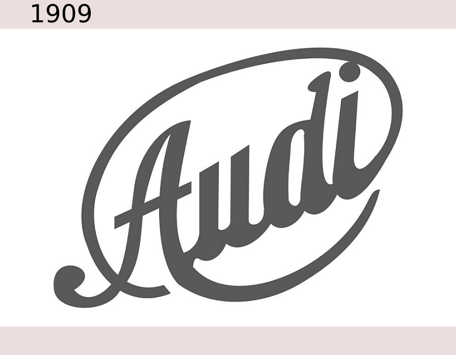
The first Audi car logo was so different from what I see today. It was such a simple and font-based logo. In an italic font, the audio word was in it. Overall, the logo was in the shape of a signature or something like that. The pre-launched Audi logo did not exist for a long time. However, the logo was so iconic and eye-catching as well.
Audi car logo changed in the beginning – of 1909
![]()
Surprisingly, the pre-launched logo was changed right before the official launch in 1909. The new design was in the letter T shape while the top was like a semicircle. On a triangle, the company name was written in Italic font. But the official logo wasn’t so attractive. Yet the company began its run with this particular logo.
Last of old Audi logo – 1909

As the previous logo wasn’t so attractive the change was unavoidable. Later, in the middle of the year 1909, the logo got a slight change. In this term, the change was on the font of the written audio mark. But the other parts remained the same.
Change in logo Audi logo for ‘Auto union’ in 1932
![]()
In 1932, Audi formed a union with three other automobile brands. The formation of the company was known as ‘Auto union’. The auto union wanted to do group business to stay in the automobile competition.
For a change in the formulation and leadership, the Audi car logo has seen a significant change this year. The new logo of the Auto Union was completely different from the old logo of the Audi brand.
The new logo was in four different circle shapes. Those circles were in chains and four names were inside those circles with different logos. At that time the previous logos of those companies were presented inside a circle shape.
Auto union logo change – 1949
![]()
There was controversy about putting the brand names in those circles. It seemed pretty inconsistent with the intention of the Union. Therefore, later in 1949, the Audi car logo changed yet again. In this term, in place of those circles, the brand names were removed by putting the word ‘Auto union’. The word Auto union was written in capital form.
Audi logo change – 1969
![]()
In the year 1969, the Audi logo saw significant change again. The name Auto union was transformed into Audi again. Therefore, changes were necessarily accepted in the logo design. The company completely renewed the logo design with the older ‘Audi logo’s concept.
Previously drawn rings were removed from that newly arrived logo. Furthermore, the letter NSU was added with the letter Audi in a different style.
The back part of the logo was a dark plate, where the fonts were in white shape. The 1969 Audi logo was a pretty straightforward one.
1978 – change of Audi logo
![]()
After 9 years, the logo of the Audi company was changed yet again. The previously drawn straight logo was transformed into an oval shape. The Audi was only mentioned in the middle part of the logo. Surprisingly, the whole logo was in red. To provide more focus on the brand name, the word ‘Audi’ was written in white large font.
This time, the logo was so eye-catching. However, the red color always raises some controversies. The same also happened with that particular logo.
The arrival of the new versions – 1995
![]()
In the year 1995, the ring design was brought again to remove the plated version. Here the rings were in 3D shape with a metallic shape. The brand name was added on the down part with a red font. The word Audi looked convincing in this version. However, the overall design didn’t touch the complete height of satisfaction.
2009 – the change of the Audi logo
![]()
In the year 2009, the word Audi was written in a smaller size. However, the positioning of the brand name was on the left side rather than the middle part. However, the circle shape remained the same. This logo design looked slightly incomplete due to the red color brand name. However, the company ran this design for 6 more years.
The final transformation of the Audi logo – 2016
![]()
Yes, the final transformation in the year 2016 was masterpiece art. All doubts were removed from this design. Still, this logo design continues with the brand.
To complete the design the letter ‘Audi’ was completely removed. Consequently, the ring color was transformed into black. The logo came up with the best transparent mode. This type of simple logo suits well with vehicles. Moreover, it looks so beautiful on cars while moving faster.
Surprisingly, there was another version of the Audi logo. It was in full silver color. However, this logo doesn’t have any brand name on it. That’s why it looks more beautiful. Of course, this is the more eye-catching version of these two logos.
Final thoughts
The Audi car logo has indeed gone through so many changes. That mainly happened to change ownership causes. However, years of evolution have left two Audi car logo designs in front of us. The current version of the Audi car logo looks well adjusted with the modern time.
FAQs
Clear further queries about the Audi car logo from this part.
What does the Audi car logo mean?
The Audi car logo has four rings on it. That means the automobile company is a joint venture of four different brands. The Audi car logo is the symbol of the Union of brands.
Why did the Audi car logo change?
The owner of the Audi car company changed several times. Therefore, the Audi car logo has undergone several changes. Another reason could be the adjustment with the period.
Will the Audi car logo change again?
Yes, there are high chances of change in the upcoming future. As the Audi automobile company is currently running as a joint venture company, the ownership could be changed. Eventually, that will bring a change in the logo shape.
How many versions of the current Audi car logo exist?
There are two versions of the current Audi car logo existing. One is in a complete black ring, and the other one is a slightly metallic ring.
notable car logos include the four rings of Audi, which represent the four companies that merged to form Audi in 1932: Audi, DKW, Horch,
Comments are closed.