When it comes to the largest automobile manufacturer company in the world, FIAT is the name that obviously comes into your mind. This Italian company expand its business in several countries and become a renowned global brand.
The sophisticated yet compact builds of FIAT’s cars are the main element that makes these cars quite outstanding! But have you ever wondered about the meaning and history of the FIAT logo – car symbol?
Well, this article will remove all your confusion regarding this matter. Here we will share how the brand changes its logo design over the decades in detail. So, without further ado, let’s learn about the interesting history of the FIAT car logo.
Quick Facts about FIAT Brand
Brand name: FIAT Founded: Jul 11, 1899 Founder: Giovanni Agnelli Main Office: Turin, Italy Parent: FCA Italy Owner: Fiat Chrysler Automobiles Official Website: www.fiat.com Official Facebook Page: www.facebook.com/fiat Logo Evolution: Yes Recent change: 2020 |
FIAT name meaning
Do you know from where the name FIAT has come? Well, FIAT is actually an acronym. It refers to Fabbrica Italiana Automobili Torino, meaning the Italian automobile factory of Turin. You know, Turin is the first manufacturing plant of the company so the company was named after where is Fiat made at that time.
The FIAT Logo History and Evolution
FIAT has changed its logo several times. From the early 20th century to now, the brand has introduced 26 logos!
The FIAT emblem front was very similar to each other. The current emblem contains a red name on a white background. Meanwhile, the badge was oval from 1921 to 1931. Then it became a vertical rectangular till 1968. After that, it was oblique until 2003 and then the round design alternated with text till the recent redesign.
In the following segment, we will cover every redesign of the FIAT sign one by one. Let’s have a look.
1899 – 1901
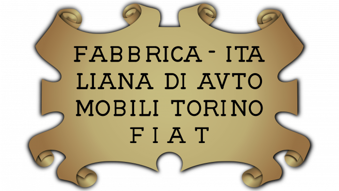
In 1899, the first logo of Fiat was created and represented the company for two years. The sign was composed of gold rectangular with curved edges. The full name “Fabbrica Italiana di Automobili Torino” and the abbreviated Fiat version were engraved.
1901 – 1903
The first redesign of the Fiat logo was pretty cool. At that time, the chief designer Mario Majoli came up with a futuristic design. He kept only the four letters with gaps between them. And with an elongated upper edge, the plate shape was rectangular.
This badge stayed with the company for only two years and then the next change happened.
1903 – 1908
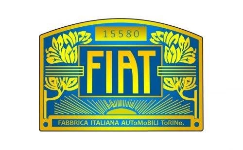
This logo was quite colorful. It was drawn in the Art-Deco style. The sign contained a bright blue and gold color palette with gold lettering representing the company’s full name and the abbreviation.
1908 – 1921
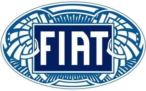
This time the design became more elegant and versatile. The design of the abbreviation remained as same as the previous one. It was placed in the center of a blue oval that was located horizontally.
The white letter against dark blue background stands out pretty well and brought a stylish vibe to the overall design.
1921 – 1925
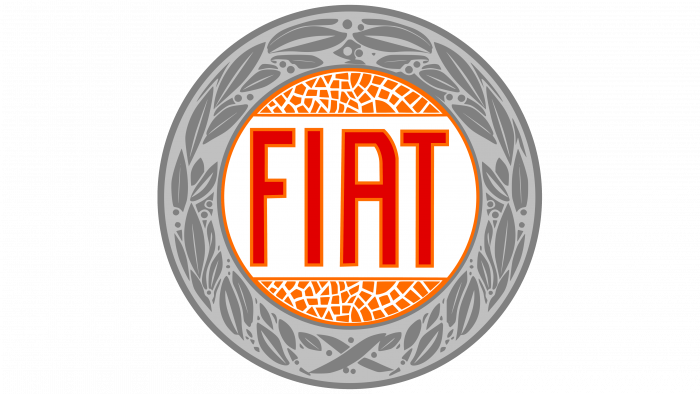
In 1921, the Fiat logo introduced a perfect circle frame for the first time. The sign was framed by a laurel wealth while the font color turns red on a white background. The whole form represented confidence and power.
Fiat decided to introduce this design to represent their success in various racing competitions that they won at that time.
1925 – 1929
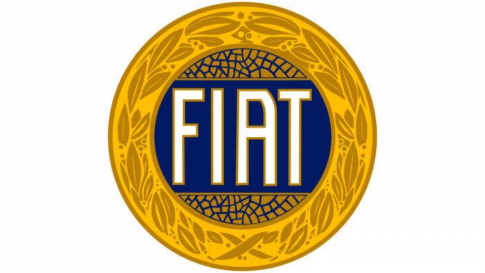
A slight was made in this time. The frame color changed to golden and a dark blue color was used for the background. Meanwhile, the abbreviation was engraved with white which look fancier against such a background.
During this time period, few changes in the color scheme were made.
1929 – 1931
This year the golden frame, as well as the lettering, turned into silver with a dark gray outline. Although the style of the letters remained the same as the previous ones, they become taller and bolder than before.
1931
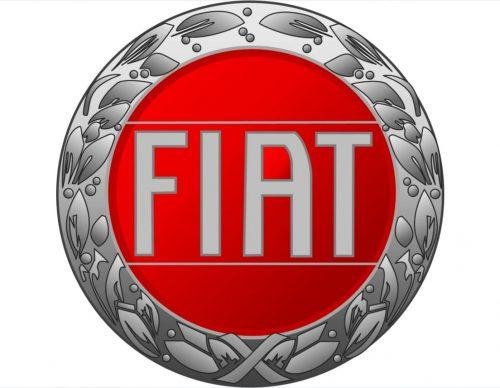
In this logo, only the background color change to bright red. This design was introduced to represent victory.
1931 – 1932
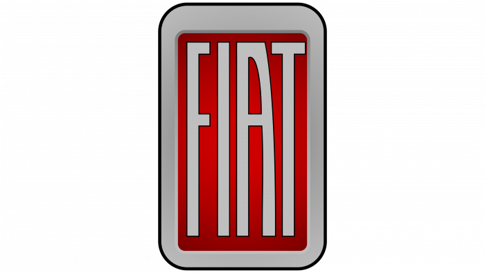
The shape of the FIAT car symbol totally changed in 1931. This time, it featured a rectangular shape with rounded corners. The background was colored red while the lettering was gray.
1932 – 1938
As you can see from the above FIAT logo images, the design didn’t change much from the previous one. The only change was that it featured a clear rectangle instead of rounded corners.
1938 – 1949
This logo stayed with Fiat for almost a decade. The shield-like shape perfectly represents the company’s racing cars.
1949 – 1959
The Fiat badge was redesigned in a more unique form in 1949. The lines of the letter became a bit bolder while the badge was made in a trapezoid shape.
1959
Although the previous two badges remained with the company for many years, this time Fiat again recreated a sign that lasted only for a few months.
Here the company added volume and 3D feeling to the logo.
1959 – 1968
A wide silver bezel and rounded corners were added to the badge this time. The design became more refined and soft looking.
1965 – 1982
In 1965, the company decided to bring back its old circular form with some modifications. The silver frame was drawn in a more minimalist way. Besides, the overall color was also modified and the image contained more shades and gradients.
1968 – 1972
A huge change was made in 1968 with a more strict and geometric design. The new form contained four black rectangles that represented each letter in silver.
1972-1999
This time the logo represented the company for almost 30 years. It featured a blue background with white lettering, giving a lighter and more modernized vibe.
1982 – 1991
Fiat featured five longitudinal stripes that looks like italic font during this era.
1991 – 1999
Here the five lines were placed turquoise parallelogram background.
1999 – 2003
The rhombuses were returned again. In this version, the logo was changed to blue and white.
1999 – 2006
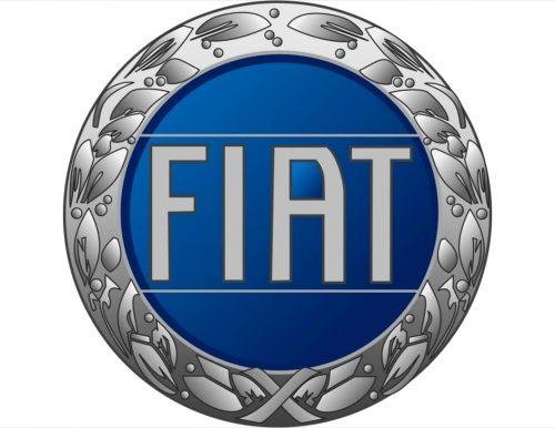
The rounded forms again came back to the field. The new logo contained blue circle with a silver frame and silver lettering.
2001 – 2006
Keeping the circle shape, the brand added more silver tone into the badge that gave a three-dimensional feeling.
2003 – 2006
With thicker lines and soft contours, the four letters were executed in this badge.
2006 – Today
The combination of round and thyroid emblem was first used in 2006. The cleaner and elegant design perfectly match the latest trends and visuals. This is why Fiat still uses this logo to represent its brand.
2020 – Today
In 2020, the last changes to the Fiat logo happened. The badge now represents the concept of minimalism.
This new version is used along with the logo created in 2006.
Final Thoughts
So now you know the meaning and history of the FIAT logo – car symbols. The logo has indeed gone through so many changes and come into today’s shape. However, we must say that all the variants are looks stunning and represent the brand’s image very well.

