Fastest and the most stylish car – Lamborghini is the proud car manufacturer that successfully combines these two in their every production. While talking about a luxury car brand, Lamborghini is the name that you surely can’t forget! The famous European company was established in 1963 in Italy.
Have you ever thought about the Lamborghini logo history? Well, this article will answer all your questions regarding this matter. So, let’s have a look.
Overview of Lamborghini Brand
Founded: 1963
Founder: Ferruccio Lamborghini
Headquarters: Sant’Agata Bolognese, Italy
Official Site: www.lamborghini.com
Lamborghini Symbol Meaning
The Lamborghini sign is quite unique and at the same time, it gives an elegant vibe! The shape of the logo looks like a shield. Besides the whole design is made on dark black background with gold outlines.
The symbol contains a golden bull that represents power and strength while the word Lamborghini is engraved on the top to complete the design.
You might think why Lamborghini uses a bull among all the other animals, right? Well, there are two reasons for using this image. The first reason is pretty interesting.
Actually, the founder of Lamborghini, Ferruccio Lamborghini was born in Taurus. So, his zodiac sign was a bull. And for some reason, Ferrucio also was very passionate about bullfighting
Because of this, the founder found himself in this animal and thus couldn’t think about anything while making his company’s logo.
On the other hand, the second reason is that bull also represents power and speed. Bullfighting is all about speed, passion, strength, and prestige. So the bull mark in the Lamborghini cars also shows its capability in racing events or a hard road.
In the following segment, we will talk about different versions of the Lamborghini logo briefly. So, keep reading to learn more.
1953 – 1963
The first Lamborghini logo was totally different from what we see today. The luxurious symbol was quite ordinary back then. It featured a simple pyramid shape that consisted of three triangles shape. Each triangle display three letters – F, L, and C.
Here the letters were written using sans-serif typeface that showed a simple yet confident vibe.
1963 – 1972
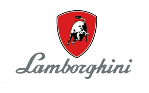
The world came to know about the iconic bull symbol in the year 1963. In this logo, a white bull is engraved in front of a red background. Meanwhile, the company’s name was written under the symbol in a stylish form.
1972 – 1974
The Lamborghini car logo doesn’t change much after the one that was introduced in 1972. This time the designer came up with a modernized design that looked like a crest shape. There was a golden outline and inside it, a golden bull was engraved in the middle.
Furthermore, the company’s name “LAMBORGHINI” was written in block letters above the bull’s head. This stunning symbol stayed with the company for only two years and then the next modification happened.
1974 – 1998
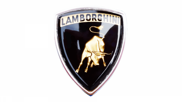
This time the company decided to go back into the black and white era once again. Now the shield is smaller than before. In the shield, the word Lamborghini was engraved on the top. Besides, the company’s name was written again in a sans-serif front beneath the emblem.
1998 – Now
This version contains only the shield. The engraved name below was no more. Yet this simplistic form expresses more details than before. This Lamborghini badge features the Lamborghini brand colors which are gold and black.
The bull is placed in the middle of the shield in this logo too. But this time there is a difference. Rather than making a simple 2D image, the designer adds enough volume and details to the image by using various shades of gold – making it more lively.
Lamborghini Emblem
During these long years of journey, the Lamborghini emblem remains almost the same. The most notable two elements – shield shape and the raging bull – remain unchanged in the whole time.
On the other hand, the shape of the bull also tells more stories. The posture represents actions as well as desire for innovations. This carefully designed mascot helps the brand to create its own unique identity and set them apart from its competitors.
Logo Colors
Although the brand use mainly golden and black color in its symbol, sometimes it also uses red and white to highlight passion and strength.
Final Words
That’s all about Lamborghini logo history. Next time you see the Lamborghini logo on cars, hopefully, this whole story will come before your mind.
And why not? The journey of the Lamborghini logo is quite interesting that is hard to forget. We must tell that the brand is indeed a pro in making a captivating logo and successfully designing one that perfectly highlights the brand really well.



Association with the silver racing cars of the 1930s, while the yellow and black shield on a Lamborghini car symbolizes the brand’s origins as a tractor manufacturer in