Volkswagen is certainly one of the global leaders in terms of the automobile industry and the most prominent European car brand. And why not?
Whether it be their performance or elegance – they are a perfect example of how vehicles should be made. You can’t help but get mesmerized by all their features. That much good and top-rated this brand is!
But do you know the golden history of this popular brand?
Without further ado, let’s know about it in detail:
What does the Volkswagen logo stand for – The Meaning of the logo
Volkswagen is one of the reputed European car manufacturers that is well-recognized worldwide for its stylish design and top-notch performance. The logo comprises the company’s initials by placing the word “V” over the letter “W” – one interacting with the other incredibly.
The blue color in the logo showcases the excellence, dependability, and elegance of the Volkswagen, while the white symbolizes nobility, warmth, purity, and a certain kind of charm.
Besides, their logo is widely credited for being one of the most memorable and famous logos lists. The term Volkswagen is made using the combination of “Volks” (people) and “Wagen” (car) – ultimately meaning “people’s car.”
Founded On: 1937
Founder: German Labour Front (DAF) Adolf Hitler
Headquarters: Wolfsburg, Germany
Volkswagen Logo History – Many things to unveil

Volkswagen’s logo has certainly gone through a lot of transformations from the time of its release to the current date. Let’s know about them one by one:
1937 – 1939
This is the debut year of this brand. Here, the letter “V” and “W” are placed one above the other, creating a geometrical monogram with straight lines and corners.
Surrounded by flag silhouettes, it resembles wings with the lines being elongated and grouped around the wheel. Here, the initials are located at a large cogwheel. In total, 4 flags with 3 black arcs were used.
1939 – 1945
Before world war II, the German automobile manufacturer removed everything that symbolized or looked like the Nazi Swastika from the logo.
Due to these changes, inscriptions are used in the central and a gear wheel. All credit goes to their unique idea and competitive balance that has made the logo practical and brutal, depicting the company’s technical skill and orientation instead of representing any political thing.
1945 – 1948
After the world war II, the brand took the initiative to change the logo with the mindset to do such a transformation that would leave everyone amazed. And nothing will remind them of the Nazis. Luckily they were successful in this attempt.
As a result, the developers removed the black color and the square lugs. As a result, the cogwheel became a beige circle with a dark brown edging strip.
The designers joined the upper portion of the “V” with the outer circle along with separating the letter “W.” and for the background, they kept it red.
1948 – 1960
This new logo is a continuation of the older version with some modifications. To keep up with the trend and the growth of the automobile industry in Germany, the logo was polished.
Here, the developers returned to the monochrome version, making it black and white again. They even thickened the outer border by joining the legs of the “W” to the circle while bringing “V” closer.
1960 – 1967
This year, the designers have squared the emblem and mirrored the colors. Meaning, they swapped the colors. Everything that was black got converted to white and vice-versa.
1967 – 1978
Here, the only change was the color. Instead of black, the emblem was changed to the sky blue color by keeping the design same.
1978 – 1989
To meet up with the progressive requirements, the management again modified the logo. As a result, the painted components got converted into white while the white into the blue.
Besides, the shade’s intensity got increased manifold because of which a light cobalt version along with an edging line appeared – making it more visible to the eyes.
1989 – 1995
At this time, the emblem was a circle with a blue frame and a wide white strip inside. Connected with the letters “W” and “V,” with a light blue background. This was the color version of the year 1945.
1995 – 2000
In this year, the logo returned to its 1978 version, except the shades were intensified. Instead of neon, a dark blue color was used.
1999 – 2000
In accordance with the previous logo, another modification took place. It was differentiated by a gradient transition presence from the middle of the edges. It was the most advertised logo of Volkswagen at that time.
2000 – 2012
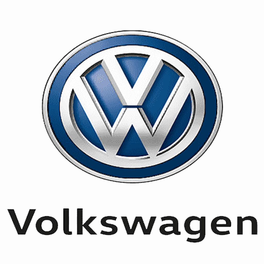
To keep up with the current trend, the makers tried to add a certain volume to the logo. As a result, along with the 3D effect, the circle got a double edging in the form of 2 thin dark lines along with a gray stripe in the middle. The blue gradient also got improved with the letter giving a more silvery glow.
2012 – Today
Here the logo comes with shiny metallic lettering to intensify the volume. This version was 1st used in the year September 2012 at the Berlin presentation of the Golf Mk7. This is the current logo that we all recognize and is familiar with the most.
To Wrap Up
That’s all about the Volkswagen logo history!
Volkswagen is such a trademark that has certainly brought a revolution in the automobile industry worth appraisal for. Be it their elegance or unique designs – they are a brand that everyone can’t help but fall in love with.
