Mazda is certainly one of the top-rated Japanese brands, which consistently tops the list of favorites almost every year. And why not!
Each of the vehicles they manufacture comes with varied kinds of features and functionalities that simply leave everyone mesmerized. Well, you can’t just help it. That much good they are!
No wonder behind such a tremendous success rate!
So, it rounds up to one of the million dollar questions, Who is Mazda owned by? Any guesses?
Worry not!
Keep on reading to get your answer along with everything you must know about this popular brand in town.
The Overview of the Mazda Logo
Founded On: 1920
Founder: Jujiro Matsuda
Headquarters: Fuchū, Aki, Hiroshima, Japan
Owner: Japan Trustee Services Bank (6.0%), The Master Trust Bank of Japan (5.4%), Sumitomo Mitsui, Banking Corporation (2.2%), Ford Motor Company (2.1%)
Slogan: Zoom-Zoom
So, Who is Mazda owned by?
Mazda is one of those brands that is known to the people for its excellence and passion in the automobile industry. And the result is right in front of us.
Each of their vehicles is simply the best, ultimately making our decision process more challenging to choose from. Thanks to the manufacturer who gifts us every year with such masterpieces, which are super hard to overlook!
So, who is the owner of this great company?
Many people tend to have this misconception that the Mazda brand is mostly owned by either Toyota or Nissan. While in reality, this is owned by Mazda Motor Corporation, located near Hiroshima, Japan.
However, once in a time, a large percentage of this company was owned by Ford. They bought a large portion of their stake in 1979 and ultimately owned a controlling portion of the share by the year 1995.
Later on, they sold all of their shares in Mazda by the year 2015 as a medium of streamlining their assets. Hence, going through a variation of ownership, the Mazda brand is finally owned by “Mazda Motor Corporation.”
Where did the Mazda name come from?
Mazda – one of the renowned Japanese companies which have gained immense fame and popularity in the world due to its top-notch speed and classy designs.
Initially, this Mazda Motor Corporation was known as “Toyo Cork Kogyo Co,.Ltd” – a producer of the manufacturing machine equipment.
Later on, in the year 1931, the company started producing the Mazda Go Auto rickshaw. Since that time, all the vehicles manufactured by this company were passed on to as the Mazda name.
However, the brand didn’t adopt the name and make it official till the year 1984. So, where did the name “Mazda” come from?
Well, it evolved from two sources, the first one from the Ahura Mazda – the Persian god of wisdom and light. While for the second one, it is the derivation from the name of the founder of the company, namely Jujiro Matsuda (pronounced as “Mazda” in Japanese).
Explanation of the Mazda Logo
Starting from the year 1920 to 2018, the Mazda logo has undergone through a lot of changes in its iconic history. Featuring the company’s name, they represent a stylish format of their first letter “M” that is sure to grab some limelight.
Something you can’t just miss seeing!
The letter is kept gently curved by turning into a stretched wing shape to ideally maintain the sharpness and elegancy that it wants to represent.
It thus develops an overall design like an owl-like attribute, as depicted by some branding experts.
Here, the stretched wings are considered to reflect the company’s ultimate goal, creativity, uniqueness, and enthusiasm in creating revolution after revolution with each of their inventions.
The Evolution of the Mazda Logo
From the year 1920 to the current date, the Mazda logo has seen a lot of transformations. However, one thing that didn’t change in all these years is their elegance, which you will notice in every logo.
In the first few years, this brand focused more on manufacturing high-quality tools and heavier machinery. As a result, the orginal brand’s logo was kept simple and minimalist. In fact, even today, their logo follows the same thing but with a touch of certain kind of elegance to it.
Let’s see all forms of changes and modifications that this Mazda logo has witnessed in these following years:
1920 – 1928

It is the first logo of the Mazda brand. This was introduced back in the year 1920 and thus has stayed with us for almost 8 years.
Here, the logo comes with a mighty abstract geometric badge with thickened black lines placed on a plain background. The round shape of the logo resembled of the shuriken, which is one of the most popular ninja weapons.
1928 – 1931

Here, the logo got redesigned in the year 1928. And instead of a black and white badge, it got converted into a perfectly round shape along with two thickened horizontal lines but in red and white badges.
The lines seemed like it was coming out of the red frame toward the badge cores. The line’s ends are quite spacious in between each other.
1931 – 1934

Founded in the year 1931, this badge used the popular diamond emblem of Mitsubishi, consisting of the three rhombuses linked up by the corners.
This ultimately gives a triangle shape. Here, the color got changed into white and blue, and the logotype was written in fancy custom cursive format over the triangular-shaped geometric badge.
1934

Here, the logotype only remained on the badge with repeated contours of the wordmark from its former version with changes to lines letter being thinner. The letter was both solid and black in line this time!
1934 – 1936

It was the first Mazda logo that appeared in the year 1934, with a simplicity but maintaining the elegance to the fullest.
Although it was just a simple wordmark, yet thanks to its italicized way of writing letters with elegant lines, they have certainly grabbed the limelight towards them. In fact, what’s more surprising is the company even released its first three-wheel in the same year as its logo.
A great thing indeed!
1936 – 1959
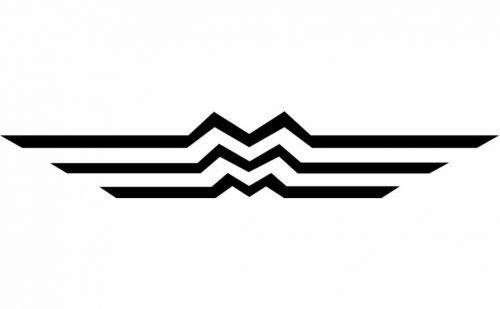
Inspired by the Hiroshima emblem, this symbolic geometrical logo was brought into the light. Here, three parallel lines accordingly form three letters “M” by centring towards its middle points.
The three “M” stands for the Mazda Motor Manufacturer, along with the icon representing the flow of the Hiroshima river.
1951 – 1972
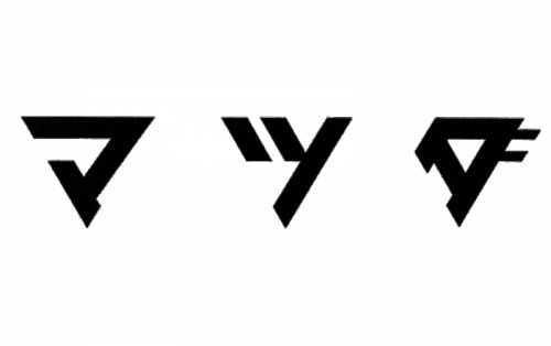
Featuring a fascinating abstract composition of three triangles pointing down – this geometric badge is back again in its black and white color. Each of them is different and unique in comparison to others, holding the mystery of the Mazda logo in them.
1954 – 1974

This time coming in a new blue and white color palette, the logo got redesigned again in the year 1954. Here, the brand’s name “Mazda” is inscribed in the uppercase with being executed in a narrowed italicized sans-serif typeface. Solid and firm letters with clean contours, bold lines and distinct edges.
1959 – 1975

In this phase, the letter “M” got a bit modified and thus coming in a softer version. This was created with the goal of making it more eye-catching and memorable for all the passengers.
The bold lines in the circular shape frame are the proof that perfectly shows the worth and value of this brand.
1975 – 1991
For about 30 years, the brand used a letter mark logo with no extra facts and symbols whatsoever. Here, just the typeface of the logo was made iconic.
And surprisingly, this iconic way of writing the logo was liked by everyone and thus is still written in this way. Not only is it easy to remember, but at the same time is soothing to the eye.
1991 – 1992
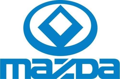
Here, Mazda decided to bring back the symbolism. As a result, in this endeavour, they have used a diamond-shaped emblem which represents the light and sun accordingly.
The first version was geometrical, which got refurnished in the year 19992 using smoother and softer lines. This is the basis of the current Mazda logo, with which we all are familiar with.
1992 – 1997

Refined and softened in the year 1992, all the shapes got cleaner and were made rounder and thin to make them more eye-catchy. Now, for the letter, it becomes a bit lighter with the letter size becoming small.
The diamond and framing became more round than angular, with a perfect balance of the straight lines. This ultimately adds up a certain sense of friendliness, loyalty and reliability towards the badge.
1997 – 2015
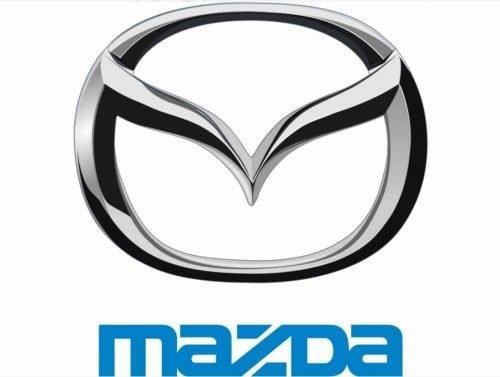
It is the most well-known Mazda symbol of all time, which was created in the year 1997. Here, the “V” shapes winds ideally represent the letter “M” in the oval frame. It just shows the brand’s flexible and future thinking and vitality towards the progressive future ahead.
The brand’s name is located underneath the emblem, coming in with a bright blue color to evoke a certain sense of flight.
2015 – 2018
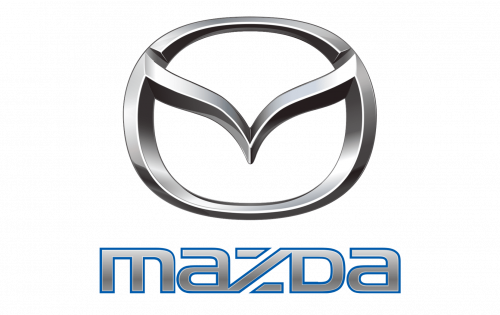
The iconic silver color remained completely untouched, with the exception of the glossy surface becoming matte. Now for the logotype, it also got transformed to silver color with gaining a thin yet distinct blue color outline, resembling the early logos of the brand.
2018 – The Current Version Of the Mazda Logo
Modern, sophisticated, neat and futuristic – this is the current logo that we are familiar with now. It is a slightly refurnished emblem from the one we had back in the year 1988, where all the letters except “D” are written in the lowercase format.
What makes this brand a total masterpiece is its simplicity and minimalistic but with a touch of elegance that is for sure will grab your attention towards it, no matter what.
To Conclude
We are at the last phase of the discussion regarding “Who is Mazda owned by?”
Since the year 1920 to the present date, this brand has encountered tons of modifications. Yet one thing that didn’t change even for a bit is certainly their excellence and passion in manufacturing vehicles for the future.
As a result, they build vehicles for all time usage! Be it increasing your confidence level to giving you the ultimate relaxation – Mazda cars will give you one of the best rides of your life!
Get ready to experience something new with every Mazda vehicle out there!

