To clear the Porsche logo design’s controversies the main reason for creating this blog. For more details about the meaning and Evolution of the famous Porsche logo, reading this article will be enough.
The short description of the brand and logo of Porsche

Foundation: 1931 Brand founder: Ferdinand Porsche Origin: Stuttgart, Baden-Wurttemberg, Germany Logo use: German automobile manufacturing company Symbolic meaning: high performance Still Active: Yes |
Porsche logo design meaning
The Porsche logo is the car or automobile company’s symbol of Germany. This logo is a symbol of wealth, status, and high performance. Southwest Germani’s automobile manufacturing company has used this design for sports cars.
Another popular saying about the Porsche logo –
Southwest Germany’s horses were the inspiration behind the Porsche logo. A well-known German horse-breeding farm was the home of strong horses. That means such strong horses have high energy of running fast without stress like sports cars. Most racing cars are meant to do high reaching, high performance during the racing hours. That’s why the Porsche logo has become the face of a high-performing automobile company.
The creation of the Porsche logo design
The creation of the logo has some controversies. Two separate beliefs are there about the design of this logo.
According to the first thought – Ferdinand Porsche’s son, who is known as Ferry, drew the logo on a napkin during the meal. The design was not made intentionally, rather than enjoying the eating time. However, during the time drawing Max Hoffman, the American Porsche distributor was present there. Eventually, he loved that design and sent it for approval by the authority. The automobile manufacturing authority also appreciated the logo. As a consequence, the Porsche logo became the face of the brand.
On the other hand, the second belief is completely different than the first one.
The Porsche logo was designed by a professional designer, by the automobile company. Among all other samples, this particular design was approved and became the brand face of this automobile company.
Later in 1952, the Porsche symbol was introduced to the United States market. Subsequently, the design became a prominent and recognized symbol of the standard and powerhouse signature of the automotive space.
The amazing history of the Porsche logo design
After the formation of West Germany in 1952, Wurttemberg-Baden and Wurttemberg-Hohenzollern combinedly formatted the federal state of Baden-Wurttemberg. As the Porsche logo was the symbolic icon of the free people’s state of Wurttemberg’s coat of arms, it became part of German history.
The unification of West Germany has tremendous value on the Porsche logo. From then, the Porches logo became a part and parcel of German history.
Essential information about the Porsche logo
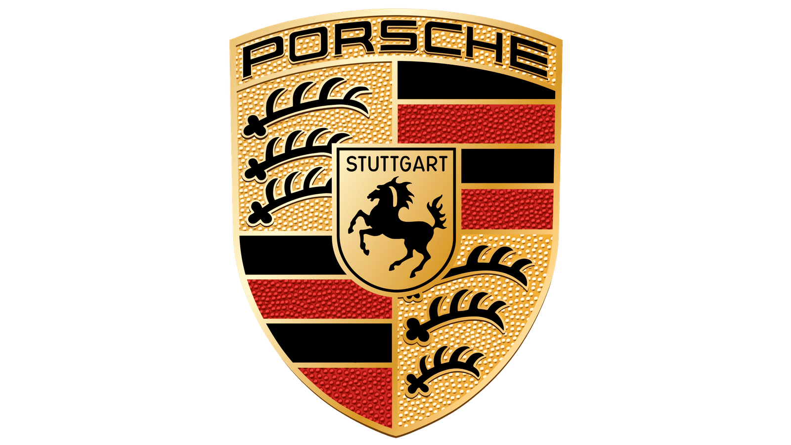
It’s a common query of people, what type of horse or animal is on the Porsche emblem? In reality, the Porsche logo crest is based on two coats of arms. Therefore, the rearing black horse is the emblem of the design. More significantly, the thought came from the traditional practice of horse breeding in Stuttgart from 950 AD.
In today’s time, the Porsche logo design means wealth and car performance. In the automobile industry, the Porsche logo is widely accepted and well granted. Surprisingly, this famous logo has gone through several stages of evolution. The later section has a brief discussion about it.
Porsche logo Evolution
The logo was designed in 1931 by Porsche himself. This was the first design that was carried out for so many years before its redesign in 1952. As it was also part of German history, the arms of Stuttgart appear in the middle of the logo like an inescutcheon.
Image: The evolution of the Porsche logo design
With the arrival of the 911, the other text-based logo was created for brand recognition.
But, in the 1994 era, the logo shape also became much smaller and the body part became thinner at the same time. Moreover, the gold color has turned into black. The one half of the logo showed more democratic, in gold background.
Conclusion
Historically, the Porsche logo is quite related to German people’s freedom movements or so-called after-war movements. There is a core relation between the unification of West Germany and this Porsche logo.
But, Porsche is the famous brand face of the German sports car company. Moreover, this logo is now well accepted as an automobile design. It’s a fascinating and impressive logo design that symbolizes the movements of a country as well as the brand face of a car company.
FAQs
The following part has answers to some common queries regarding Porsche logo design.
Is the Porsche logo real gold?
Answer: Yes, the logo is gold plated and the color is meticulously applied by hand. Thereby, the traditional logo needed to pass extensive quality testing.
What does the Porsche brand stand for?
Answer: The name of this brand stands for ‘highest quality. The automobile is high performing and the best for ranching is the main standing of this design.
What font does Porsche use?
Answer: The current font is ‘Porsche Next.’ But the previous font of the Porsche logo was ‘Porsche Franklin Gothic’.
What is the slogan of Porsche?
Answer: Porsche is now commanding the logos of multiple automobile companies. Hence, the slogan is ‘winning together.
What makes the Porsche logo amazing?
Answer: The history and the evolutions have been the most amazing part of the Porsche logo. On one side the logo is part of German history, and on the other side, this logo is the face of a leading automobile company.
